")
Great typographic solutions for low resolution displays have been here since Zuzana Licko designed Lo-Res, in 1985 (https://www.emigre.com/Fonts/Lo-Res).
That being said, I wanted to bring a few ideas from an exercise I did, finishing a course at a graphic design school, here in Rio.
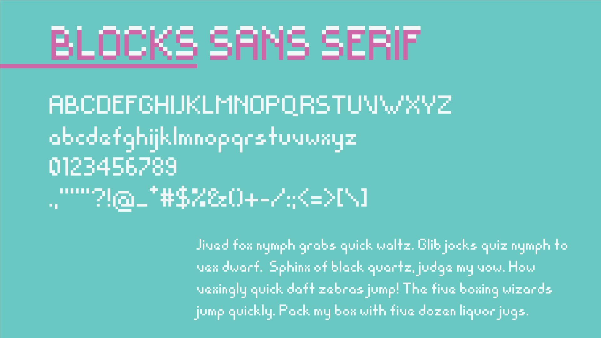
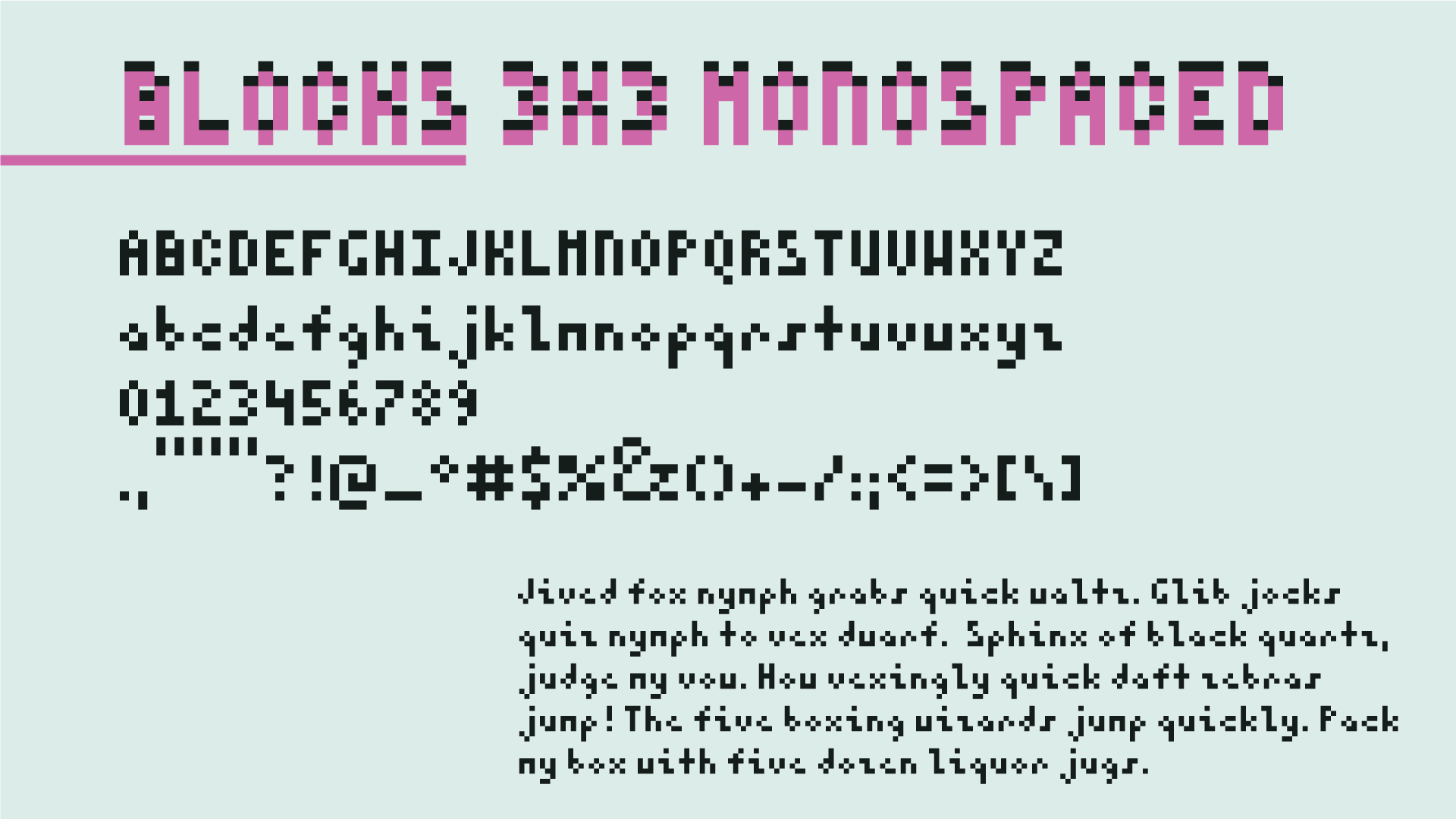
These fonts have the same basic structure with variations such as a serif version, an extended version, a minimalistic version, where the x-height of the character is the same size of its width (plus it is monospaced, so all the characters have the same width) and a version where the general structure has twice the width, so it brings a 16bit vibe to it.
blocks-sans-serif.ttf blocks-serif.ttf blocks-3x3-monospaced.ttf blocks-16bit.ttf
All fonts here have the basic latin characters (with the exception of the blocks-16bit.ttf). If you need more characters or have any suggestions, please contact me ;)
Made with Fontstruct. You can check the whole list of characters at https://fontstruct.com/fontstructors/1090663/leonardocosta
Thanks!
End User Licence Agreement (EULA).
